It’s that time of the year again. Spotify has just teased that its annual marketing campaign, Spotify Wrapped, is right around the corner. “Get ready to feel things. #SpotifyWrapped is coming,” the streaming service posted.
The popular feature drives user-generated content by providing a year’s worth of listening data to its free and premium subscribers. Through 2023 Wrapped, users can find out their top artists, songs, podcasts, and more listening highlights to share with their friends on social media.
As Spotify describes it, Wrapped is “that time when hundreds of millions of listeners around the world come together to reflect on the music that made their year. It’s also a time for fans to connect with the artists that moved them most.”
Amid all the excitement, some Spotify users are nervous that their self-confessed “basic” music tastes will be “exposed” to all their mutuals. What would come in handy right now are similar applications that use Spotify listening data to reveal interesting insights about our music preferences.
Fortunately, there are more than a handful of such Spotify Wrapped alternatives. You can use these for a multitude of reasons: to become self-aware about your top music choices through an interim check, to preempt the eventual embarrassment by cramming in some last-minute “socially acceptable” listening sessions to cheat one’s data, or simply just for fun.
How Bad Is Your Streaming Music?
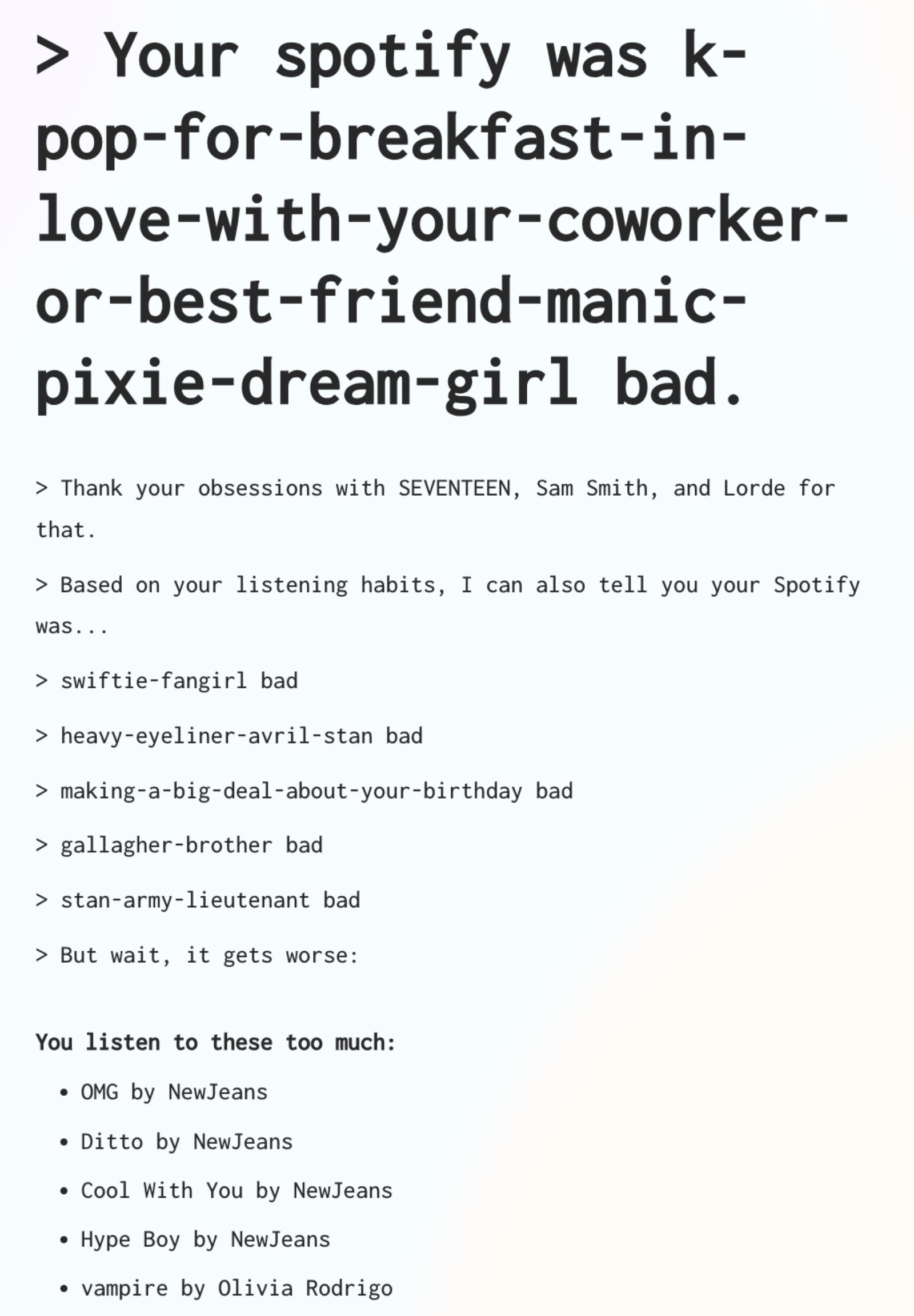
How Bad Is Your Streaming Music will roast you in advance to prepare you for imaginary haters. Regardless of who or what you listen to, this judgmental app will always have something to say. The satirical project “does not use real artificial intelligence, but a faux pretentious music-loving AI,” using a code that makes a customized set of jokes from its database paired with insights found in your streaming data.
Icebergify
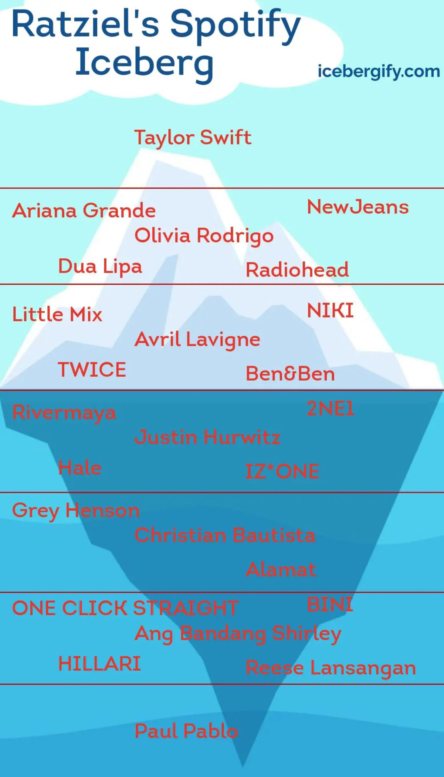
This open-source tool creates an “iceberg” style chart of one’s favorite artists on Spotify. Icebergify uses “popularity” rankings calculated with accessible Spotify data, such as streams, shares, saves, likes, followers, and other factors.
Instafest
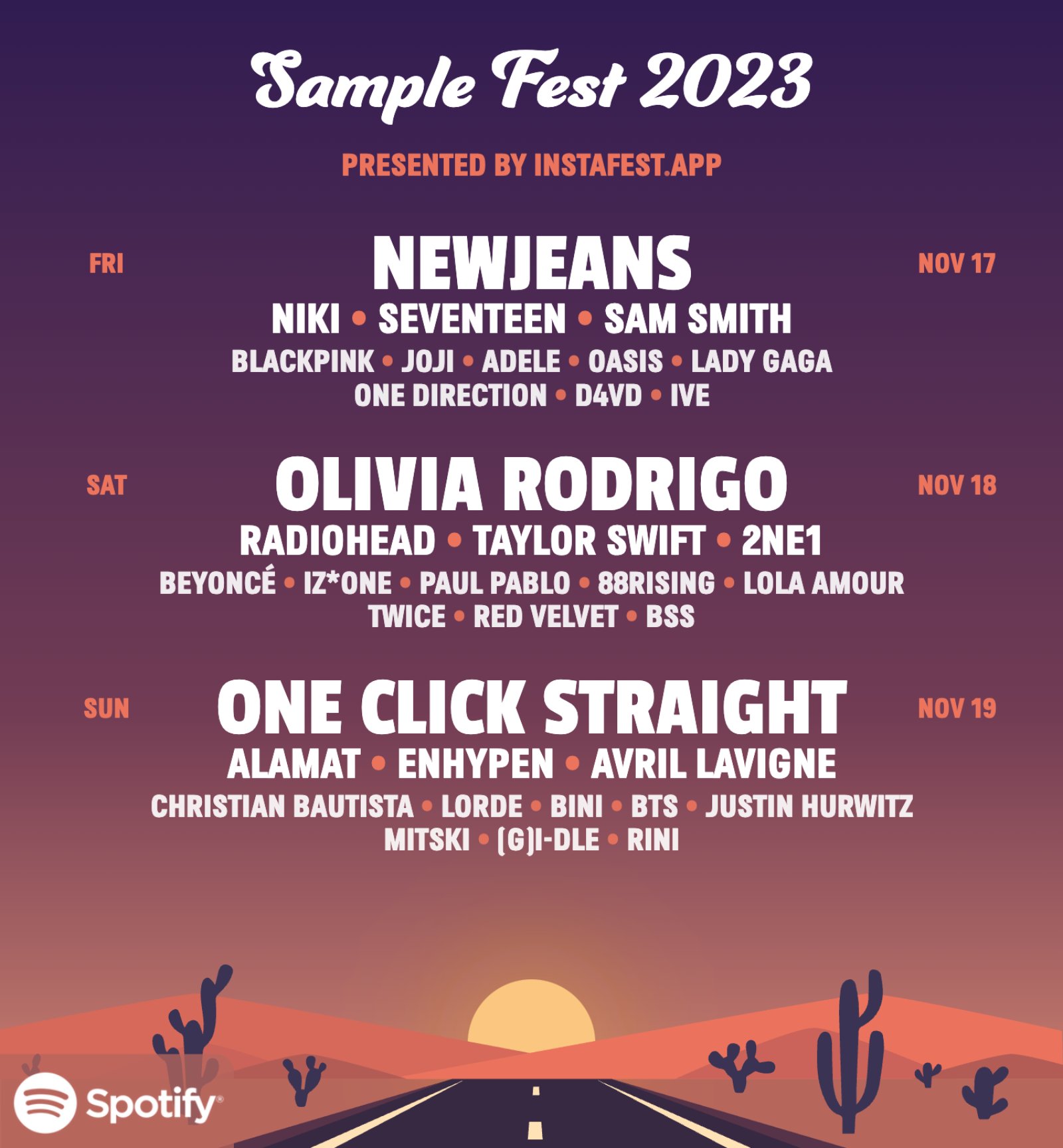
Instafest visualizes Spotify data as a music festival poster with your top artists as the imaginary concert headliners. One can choose to limit the dataset for the last four weeks, six months, or all-time. Moreover, one can change the poster’s style to Malibu Sunrise, LA Twilight, Mojave Dusk, Indio Midnight, Valley Sunset, and Desert Nova.
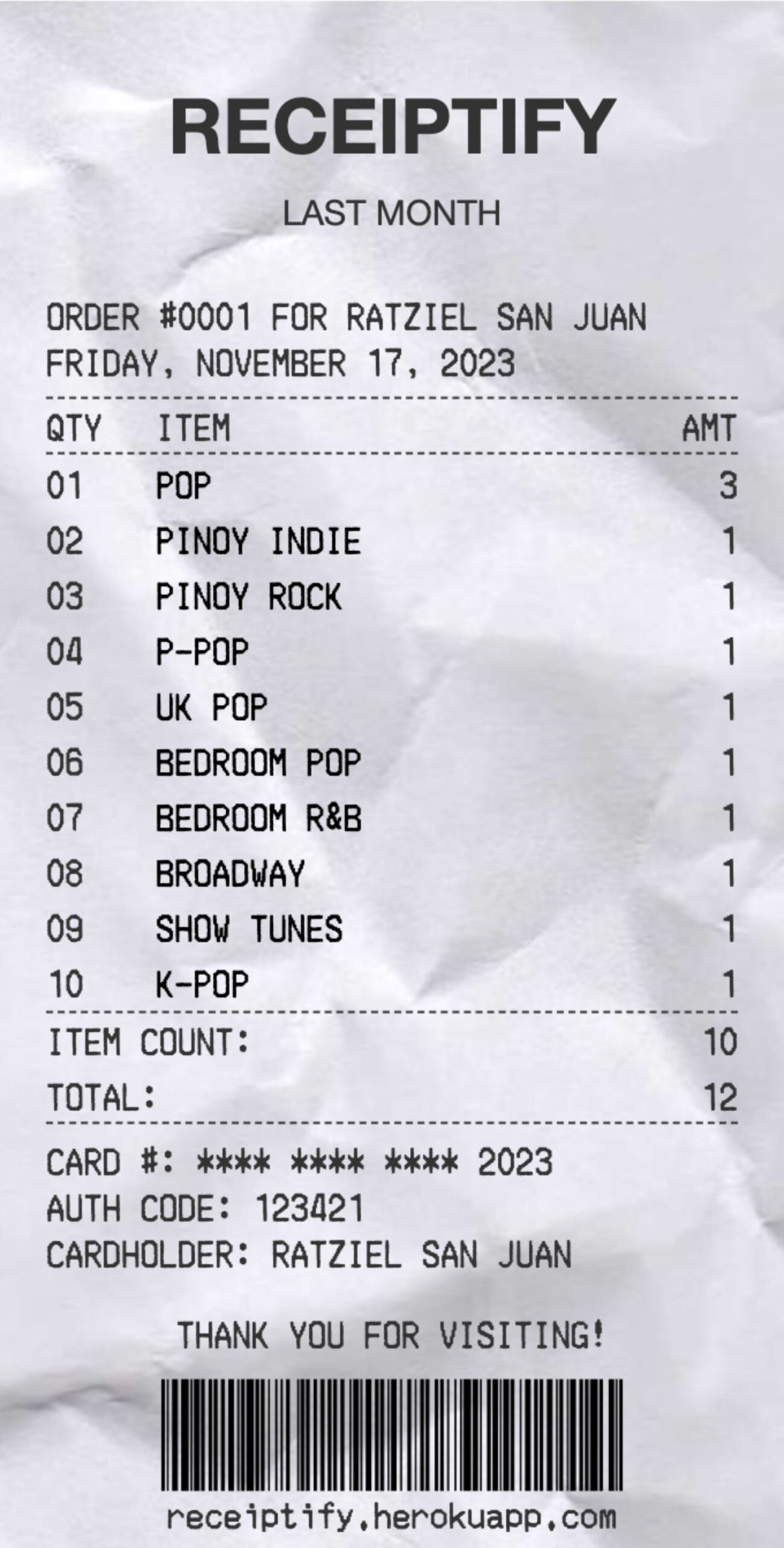
Receiptify
Check your top artists, tracks, genres, and stats in the form of a neat little receipt through Receiptify. It visually ranks your top 10 of the chosen indicators in order, complete with an order number, partially redacted card number, authority and bar codes, as well as digitally rendered creases.
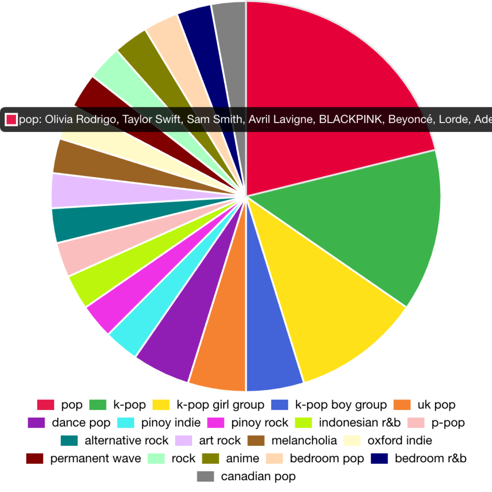
Spotify Pie
Spotify Pie cooks up a convenient pie chart to see how much space one’s top music genres take up in their overall listening experience. Below it is a text visualization using typographical hierarchy to show which music artists one listens to from greatest to least.
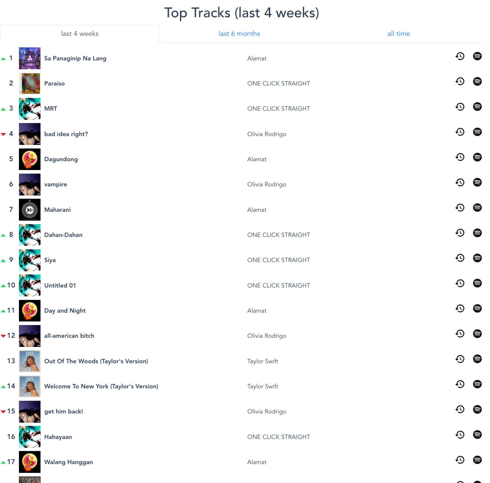
Stats For Spotify
Through Stats For Spotify, users can choose from a variety of simple but effective data visualizations to glean fast insights from their listening statistics. This includes a music chart-inspired feature that displays rising and falling tracks in one’s playlist.
Visualify
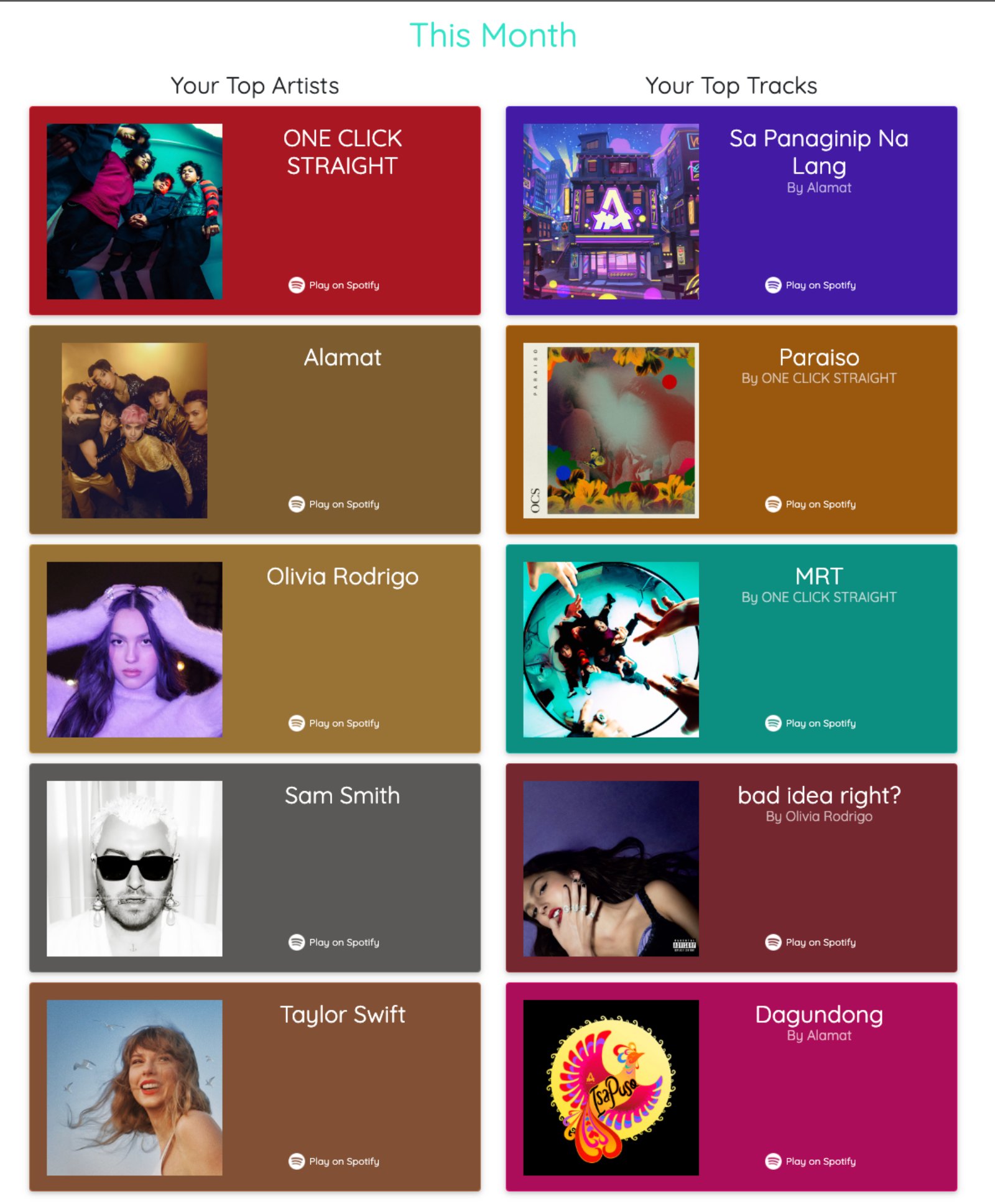
Through Visualify‘s simple scroll-down interface, a user can find their top five artists and tracks for this month, this year, and all time.
